Elif Akmanlar
One landing, various needs
I worked as a UX designer, explored various interaction flows and information architecture options. Moreover, I created user journeys, data informed personas, conducted usability tests, held a workshop with users. Product managers and fellow designers supported me along the journey.
Billogram
Billogram is an invoicing solution that aims to deliver a better payment experience, so that businesses can retain their customers. It is chosen by service providers who are regularly sending invoices and want to build a good relationship on every touch point.
https://www.billogram.com/


Pain point: One invoice at a time
When I first joined Billogram, users would receive a notification such as an SMS or an email. Once they open the notification, users were directed to a webpage and they were expected to pay the invoice straight away. In other words, users would receive one invoice at a time and they would miss the opportunity complete the task easily if they postponed paying it. Because the more time they took, the more they would struggle to find the invoice notification together with the right invoice link.
Design process
- While using Google Analytics, I realised that significant amount of users visit their invoice several times before they pay it.
- I validated through a survey, Hotjar recordings and a set of interviews that the user journey is not as simple as receiving an email notification and paying the invoice.
- I built personas and carried a workshop with users.
- I sketched various interaction flows and information architecture options. Chosen alternatives became part of the first prototype.
- I conducted a usability test with the users. According to the feedback I received, we tweaked some of the design details together with my former colleagues.
Solution
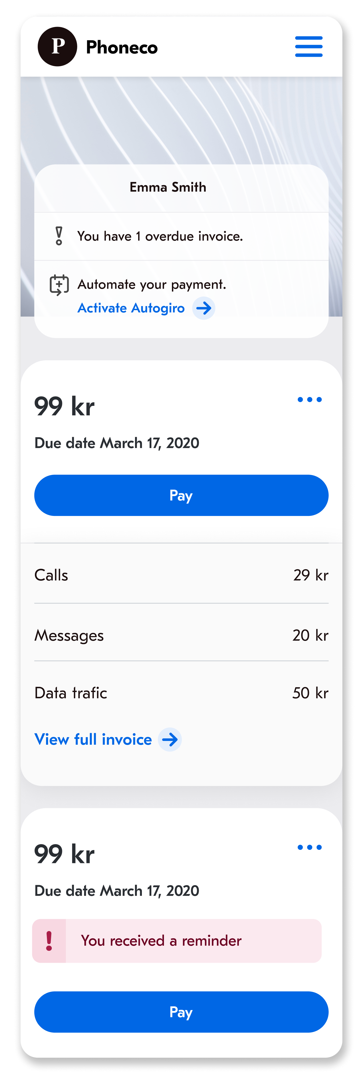
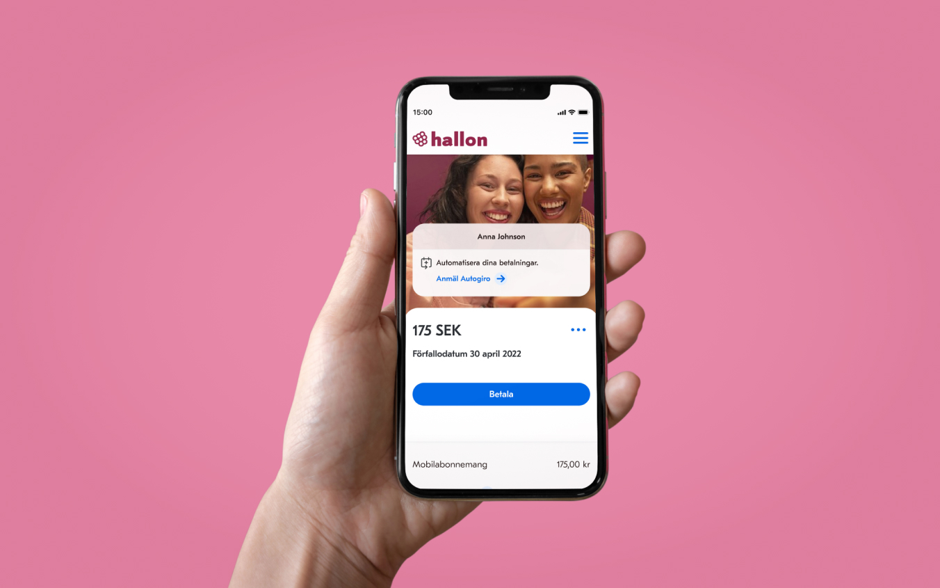
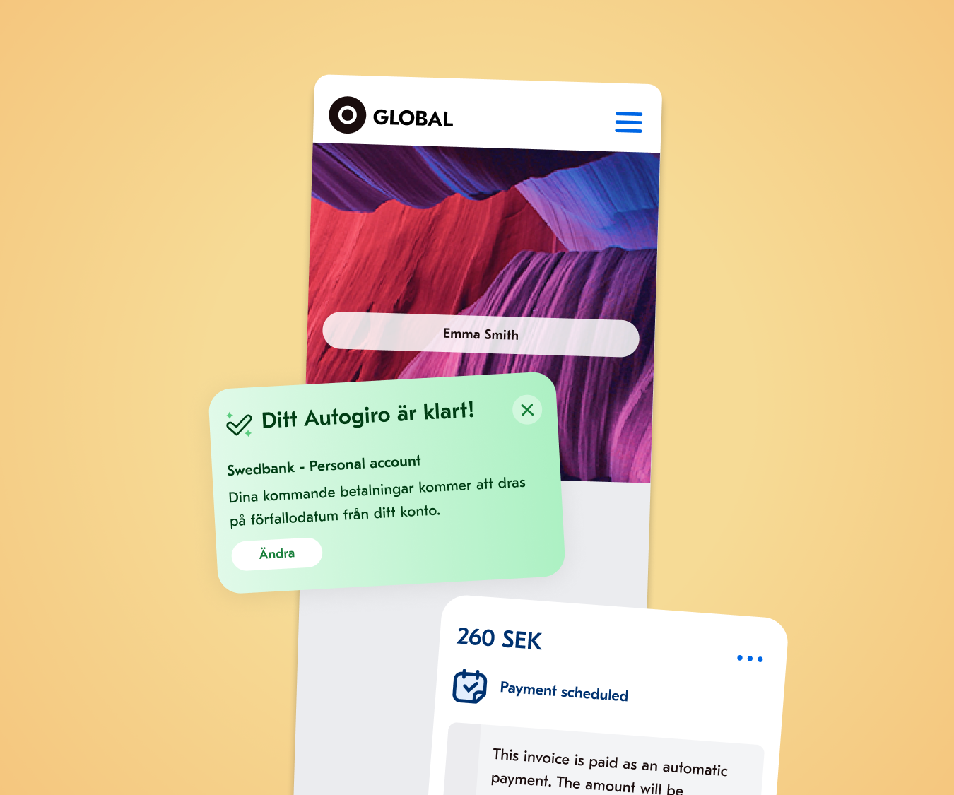
- User lands on a dashboard instead of a single invoice, so that they don't have to rely on notifications.
- Users can identify their name. Research activities revealed that customers are not comfortable proceeding to pay their invoices before they see their name.
- Users get an overview with the help of a notification center.
- Clear call-to-action button (Pay) is placed for the most important activity. Intentionally, there is no secondary action that competes with it.
- Cognitive load is kept to minimum by showing only the most relevant information: amount, due date, title of the specification items.
- Specification details can be long. Depending on the scenario, user may need to proceed to see the consumption details. In that case, they can tap on / click on "View full invoice".
- Invoices are shown on separate cards.
Personas
Personas are informed by Google Analytics metrics, Hotjar recordings, interviews as well as a survey that was shown on the landing page.

Alfred subscribes to a phone operator for his internet, SMS, phone calls and he pays a static cost. There is one item under specification and he knows what it is.
He has got an internal clock regarding the due date: he sees the notification mail that informs him about the invoice, yet he ignores it. He searches his inbox to find the notification only when the due date is on the corner. He clicks on the mail, and then lands on the invoice, finally pays the invoice.
| Activity | Search of the email | Open the email | Open the invoice | Find the button to pay the invoice | Click on ‘Pay with Swish’ |
|---|---|---|---|---|---|
| Touch points | Notification email | Notification email | Notification email | Web invoice | Web invoice |
| Channels | Email client | Email client | Email client | Browser | Browser |
| Opportunities | Eliminate all the time and effort that is spent on the email client by providing a landing page to the user | Make his choice of payment button easy to recognize and easy to access | |||

Anna receives an electricity bill every month and the cost is dynamic. There is one item under specification and she knows what it is.
She opens the email notification every time she receives it. She checks if the amount is reasonable and the due date is issued as expected. She prefers to pay all of her invoices on a certain day. She searches her inbox to find the notification 18 days later. She clicks on the mail, and then lands on the invoice, finally pays the invoice.
| Activity | Open the notification email as it arrives | Checks the correctness of the amount and the due date | Search of the email | Open the email | Open the invoice | Find the button to pay the invoice | Click on ‘Pay with Billo’ |
|---|---|---|---|---|---|---|---|
| Touch points | Notification email | Notification email | Notification email | Notification email | Notification email | Web invoice | Web invoice |
| Channels | Notification center | Email client | Email client | Email client | Email client | Browser | Browser |
| Opportunities | Eliminate all the time and effort that is spent on the email client by providing a landing page to the user | Make her choice of payment button easy to recognize and easy to access | |||||

Sofia receives an electricity bill every month and the price is not fixed. There is one item under specification and she knows what it is.
She believes that paying attention two times on the same thing is a waste of time, so she checks her personal email account only once a day. She opens the notification mail and then she lands on the invoice, finally pays the invoice.
| Activity | Review the inbox | Open the email | Open the invoice | Find the button to pay the invoice | Click on ‘Schedule a payment’ |
|---|---|---|---|---|---|
| Touch points | Notification email | Notification email | Notification email | Web invoice | Web invoice |
| Channels | Email client | Email client | Email client | Browser | Browser |
| Opportunities | Let her to semi-automate her payment: the payment is scheduled automatically, yet she confirms the action each month. | ||||

Gustav subscribes to a phone operator for his internet, SMS, phone calls and he pays a fixed price. This month he exceeded his data limit by mistake, so he requested 2GB more data.
He opens the email notification that he receives and lands on the invoice. He checks if his additional purchase is placed accurately.
| Activity | Open the notification email as it arrives | Open the email | Open the invoice | Find the specification | Read the specification carefully |
|---|---|---|---|---|---|
| Touch points | Notification email | Notification email | Notification email | Web invoice | Web invoice |
| Channels | Email client | Email client | Email client | Browser | Browser |
| Opportunities | Show the specification items on the notification email |
- Make specification items easy to find - Remove the extra information that is confusing to B2C customers - Highlight the additional cost that is out of ordinary |
|||

Malin receives an electricity bill every month and the price is not fixed. There is one item under specification and she knows what it is.
She pays all her invoice via efaktura. She visits her online bank and she thinks that the total sum is too high this month. She goes to the invoice and checks if there is a mistake on the specification such as two items or being charged for wrong item. She searches her inbox to find the notification mail, she clicks on the mail, and then lands on the invoice, finally reads the specification.
| Activity | Review the inbox | Open the email | Open the invoice | Find the specification | Read the specification carefully |
|---|---|---|---|---|---|
| Touch points | Notification email | Notification email | Notification email | Web invoice | Web invoice |
| Channels | Email client | Email client | Email client | Browser | Browser |
| Opportunities | Eliminate all the time and effort that is spent on the email client by providing a landing page to the user |
- Show what neighbours had spent this month - Show the weather last year on this month - Ask if she had purchased a new device - Highlight the additional cost that is charged because of bureaucratic reasons |
|||